Redesigning Erica’s Interaction Model
Senior Experience Designer / Project Lead
Led a redesign of Erica’s core interface patterns, using behavioral data and research insights to align the conversational experience with how users actually interact with it.
Key Insight
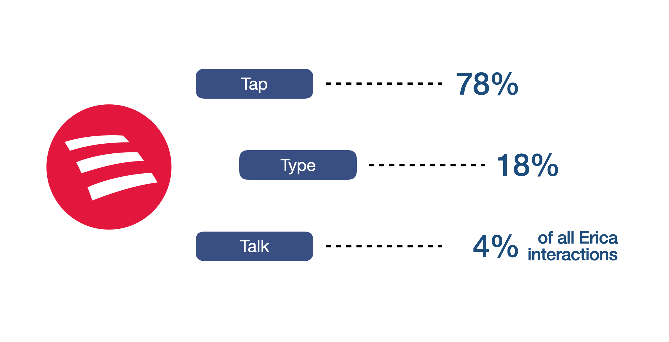
User behavior revealed a clear mismatch between Erica’s conversational framing and how users actually engaged with the product.
Users strongly preferred tapping over typing or speaking
Open-ended input created friction and inconsistency
Structured options improved speed and clarity
The Opportunity
After several years of usage, Erica had accumulated meaningful behavioral data that challenged the original design assumptions.
The interface was built around a conversational, voice-first paradigm, but in practice, users overwhelmingly relied on structured, tap-based interactions.
This created an opportunity to redesign the experience so that its interaction patterns better reflected real user behavior.
The Shift
We moved from an interface that implied open-ended conversational input to one that more clearly supports structured, user-led actions.
The redesign focused on making interactions more predictable, recognizable, and aligned with user expectations—while still preserving the flexibility of a conversational system.
My Role
Led the redesign of Erica’s core interaction patterns, guiding both visual and interaction design across the system.
Defined updated interaction patterns for Erica’s conversational UI
Led exploration of alternative pattern treatments and behaviors
Coordinated design reviews and alignment with product, leadership, and engineering
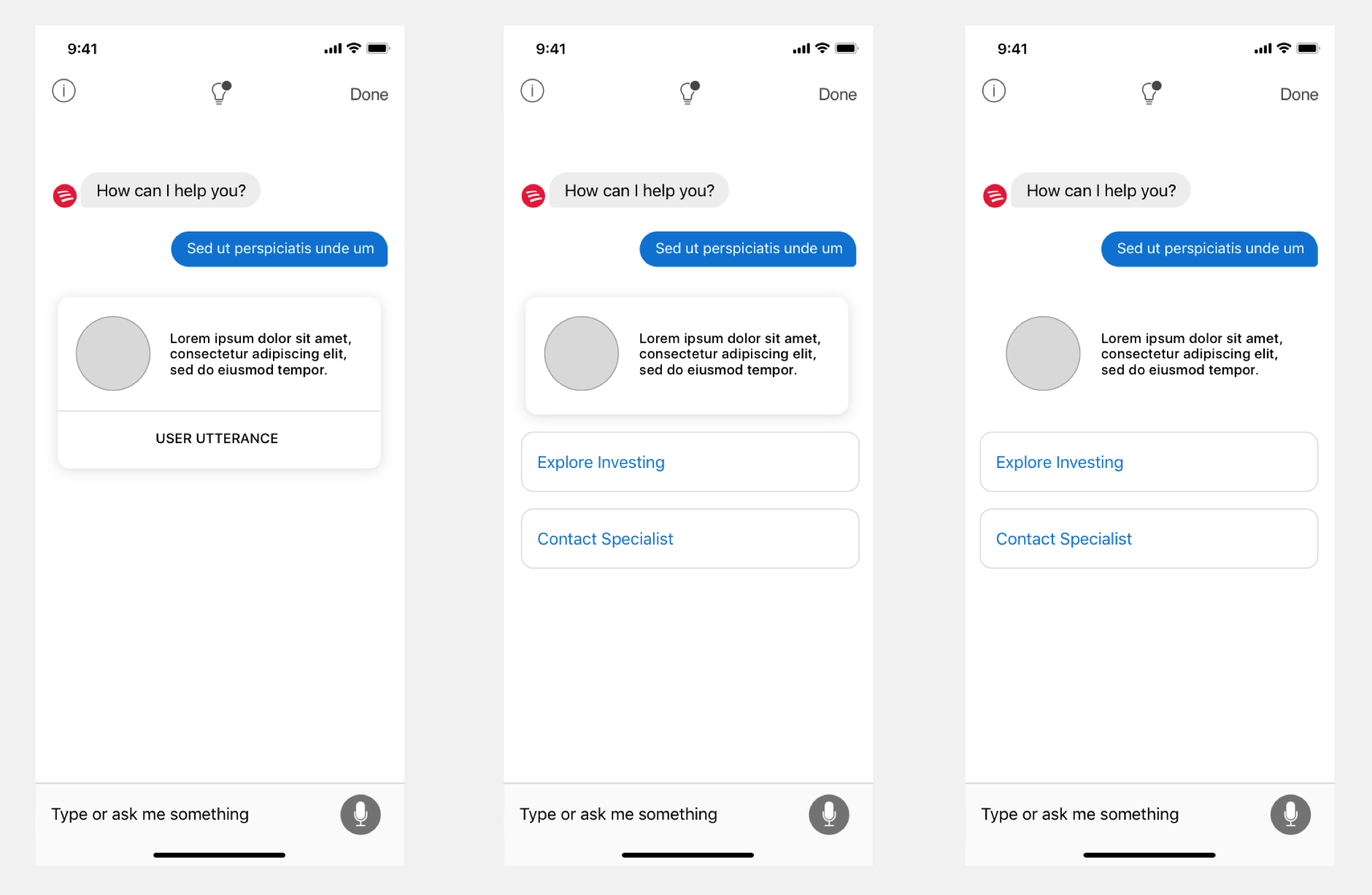
Rethinking Interaction Patterns
A core part of the work involved re-evaluating how actions and information were presented within the interface.
We explored multiple variations of similar interaction patterns to better understand:
how users interpret different layouts and structures
which patterns most clearly communicate available actions
how visual hierarchy affects user behavior
These explorations informed how actions, hierarchy, and layout were standardized across the system.
Refining Component Behavior
Research indicated that some existing UI patterns did not clearly communicate what would happen when users interacted with them.
We revisited the system’s component patterns to improve clarity and consistency.
Refined button and action styles to better match user expectations
Reduced ambiguity between conversational content and actionable UI
Established clearer distinctions between different types of interactions
This work helped ensure that visual presentation more accurately communicated expected outcomes.
Establishing a More Coherent System
The redesign brought greater consistency across Erica’s interface by aligning interaction patterns, visual hierarchy, and component behavior.
Created a more predictable interaction model
Improved clarity across the experience
Established reusable patterns that could scale across features

Validation and Iteration
We tested alternate pattern treatments to identify which approaches users interpreted most clearly.
Evaluated different interaction structures and visual treatments
Iterated based on user feedback and performance
Refined patterns to better align with user expectations
Outcome
The redesign established a clearer and more scalable interaction foundation for Erica.
Improved alignment between interface patterns and user behavior
Reduced friction caused by ambiguous or unclear interactions
Created a consistent and predictable conversational experience