Bank of America app
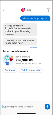
Structured, touch-first interface
Bank of America · Erica
I led the redesign of Erica’s interaction model, using behavioral data and customer research to create clearer patterns for how people actually engaged.
I led the redesign of Erica’s interaction model, using behavioral data and customer research to create clearer patterns for how people actually engaged.
The opportunity
Erica was originally designed to prioritize interactions that felt conversational. Whether customers typed or spoke, the assumption was that the most conversational approach would create the best experience.
The limitations of that assumption only became clear over time. After years of use by millions of customers, behavioral data showed that people often preferred to tap clear, structured interface elements rather than type or speak their way through an interaction.
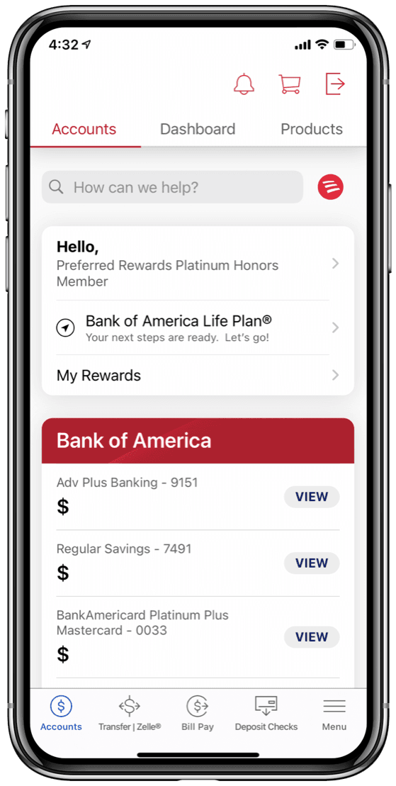
The interface had also developed a visual and behavioral disconnect from the rest of the Bank of America app. The opportunity was not simply to modernize Erica's appearance. It was to rethink the patterns shaping how customers moved through the experience.
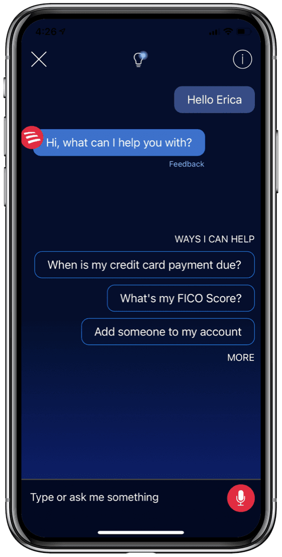
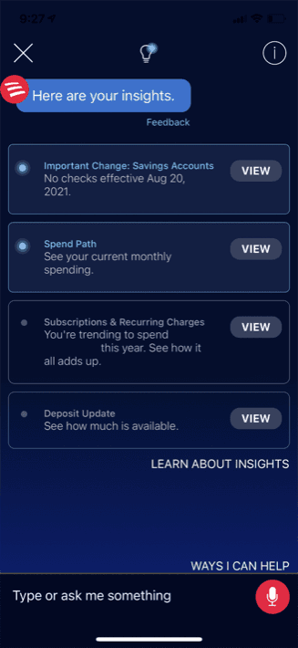
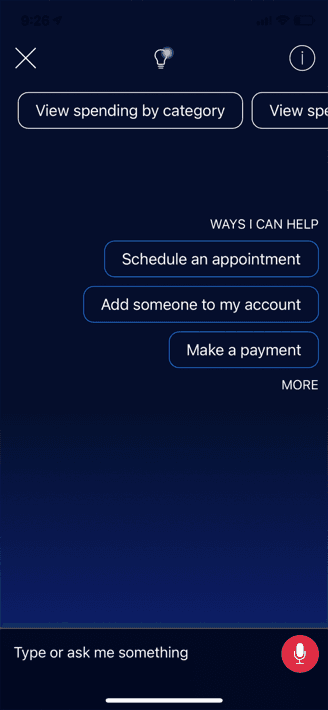
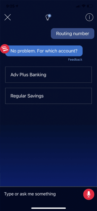
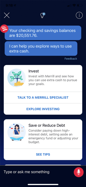
The original Erica experience felt visually and behaviorally separate from the mobile app around it.
Structured, touch-first interface
Conversation-first interface
Understanding behavior
Usage data showed that 78% of Erica interactions happened through tapping, while only 18% involved typing and 4% used voice. Despite being presented as a conversational assistant, Erica primarily functioned as a touch-based experience.
We also evaluated individual patterns across the product. Some structured interactions were immediately understood, while others introduced uncertainty through unclear hierarchy, ambiguous actions, or unnecessary conversational steps.
These findings changed how we evaluated the system. Instead of asking whether an interaction felt conversational enough, we could ask whether it clearly supported the behavior customers were already demonstrating.
Most customers interacted with Erica through structured, tappable controls—not through typing or voice.
The interface was already functioning primarily as a touch-based experience.
A secondary interaction behavior.
A small share of Erica interactions.
The methodology
I led the redesign across research, pattern exploration, testing, and development of the proposed interaction model.
I explored multiple versions of shared patterns—varying the placement, hierarchy, grouping, and presentation of actions while preserving the same underlying customer task.
Research allowed us to compare those alternatives and identify which details helped or hindered comprehension. Looking across multiple studies revealed patterns around when actions should remain attached to content, when choices should be separated, and how structured interface elements could coexist with conversational messaging.
The objective was not to optimize a handful of screens. It was to identify principles that could improve the shared interaction model across Erica.
We showed customers existing Erica affordances and asked what they expected after tapping each one.
64%
predicted correctly
95%
predicted correctly
85%
predicted correctly
52%
predicted correctly
The broader finding
Performance reflected both the clarity of an affordance and the consistency of how patterns were applied across Erica.
The redesign
The redesigned model treated conversation as one part of the experience rather than the container for every interaction.
Messages continued to provide guidance and context, but structured interface elements took on more responsibility for selection and action. Choices became easier to scan, related actions were grouped more clearly, and customers could better distinguish between information from Erica and the steps available to them.
The visual system also moved closer to the broader Bank of America experience. A lighter interface, clearer hierarchy, and more familiar controls reduced the sense that customers were entering a separate product when they opened Erica.
The result was not less conversational. It was a clearer division of responsibility between language and interface.
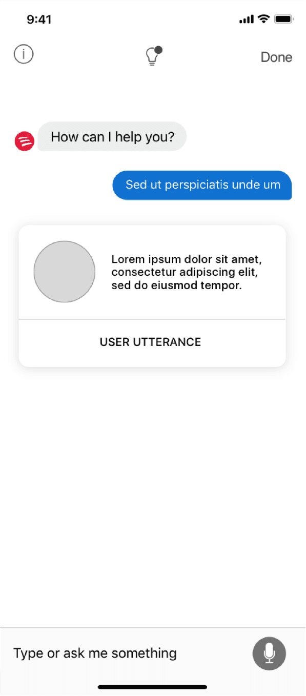
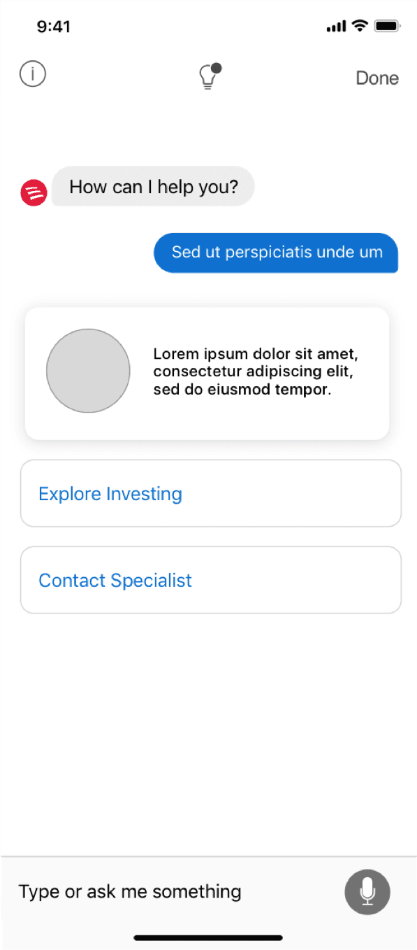
By separating and recombining content, actions, and containers, we could evaluate which parts of the established pattern supported clarity—and which were simply inherited conventions.
Variation A
Variation B
Variation C
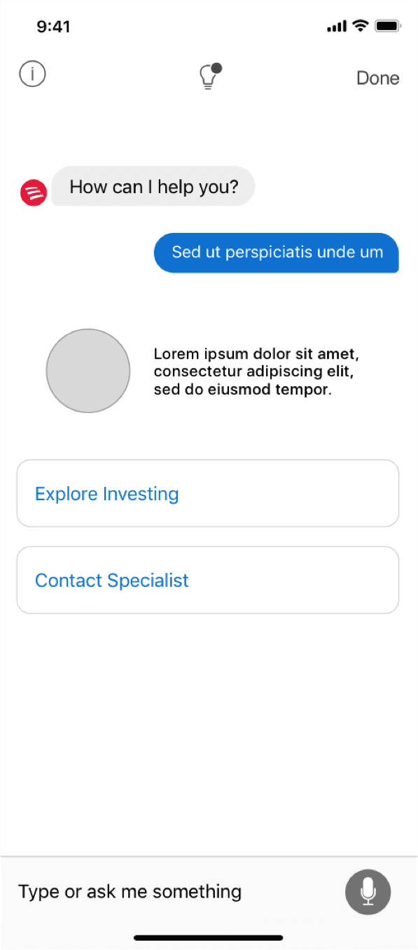
Same task and content. Different relationships between information and action.
The system
Improving individual screens was only part of the opportunity. Because the same interaction patterns appeared throughout Erica, every validated change had the potential to improve a much broader range of customer experiences.
I translated the research into guidance for conversational actions, choice tiles, structured selections, and the relationship between messages and interface components.
Choice tiles, for example, created a consistent pattern for presenting simple selections, explanatory content, account information, and other structured choices. When selected, the relevant label could transition into the conversation while unselected options disappeared, preserving continuity without forcing every interaction into a traditional chat bubble.
The resulting guidance gave teams a shared foundation for designing new experiences while allowing the system to evolve beyond assumptions established when Erica was first introduced.
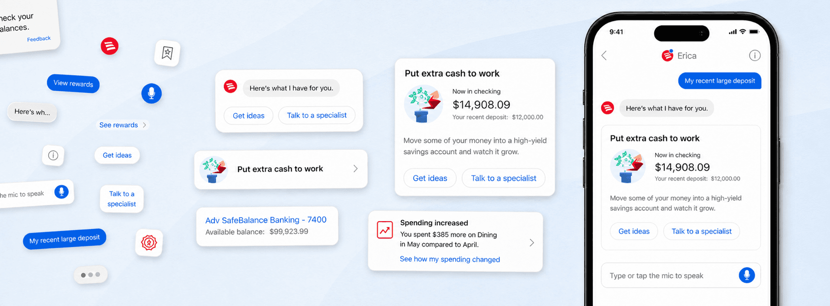
The redesigned system established a consistent visual hierarchy across Erica's core interaction elements.
A clearer distinction between customer input and Erica’s response.
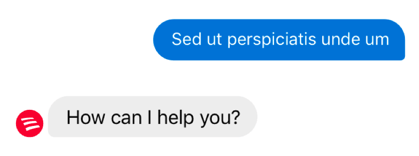
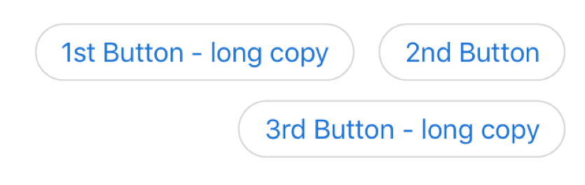
Compact actions for short, immediately scannable choices.
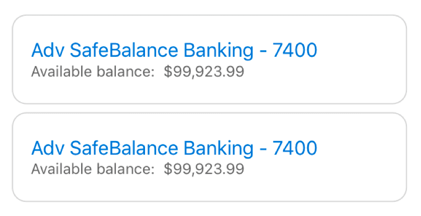
Full-width structure for longer or more complex options.

Structured details that remain readable within the conversation.
Project outcome
The redesign produced a fully developed and research-informed interaction model for Erica. The proposed direction was approved, and the new model was presented through a working, fully documented design system prepared for implementation.
The work established clearer conventions for conversational actions, choice tiles, structured selections, and the relationship between Erica's messages and the surrounding interface. Together, these patterns created a more flexible foundation for increasingly complex financial experiences.
I left Bank of America after completing and delivering the redesign. The work was not ultimately implemented after funding for the initiative was withdrawn following my departure, so post-launch customer metrics are not available.
The project demonstrated how research could move beyond isolated usability findings to challenge an established product convention and define a cohesive, system-level direction. It reinforced the value of grounding product change in observed behavior, testing the underlying patterns, and carrying those findings into a system capable of supporting the product as a whole.
A lighter, more structured system designed to work across increasingly complex Erica experiences.
Erica within the broader app
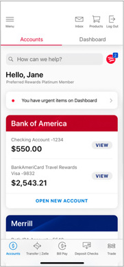
Content organized for scanning
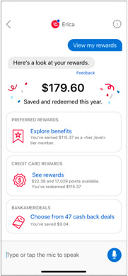
Insights presented as clear choices
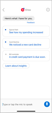
Conversation and interface working together